


Using colour on your CV: a quick guide to getting it right
Get a Free Resume Review4 min read. Updated on November 07, 2024
Table of contents
Table of contents
Table of contents
Table of contents
Looking to give your CV a splash of creativity? Read our advice first!
To create an interview-winning CV, you need to use everything in your arsenal. While looks aren't everything, your CV design matters more than you might expect, especially since recruiters typically spend only a matter of seconds looking at each CV that comes their way. However, before you get excited with applying visually engaging elements, particularly CV colours, there are some important considerations to keep in mind first.
Should you use colour on your CV?
If you want to make your CV stand out, you may consider adding some colour into the mix. A decade or so ago, using CV colours was considered unacceptable and unprofessional. However, times are changing. Modern-day employers are used to seeing CVs that are more visually engaging, so you have some room to play around here.
However, before you decide to use colour on your CV, consider whether it suits the role you're applying for. If you're going for a traditional role, such as a lawyer, you may want to refrain from using anything other than black and white. On the other hand, if you're applying to be a graphic designer, it may make sense to use colour.
What are the best colours for a CV?
Not sure what the best CV colours are? There's no definitive answer. However, before you decide on a design, it's worth looking into colour psychology.
While more scientific research is certainly needed in this area, some experts have theorised that each colour represents a different emotion. Let's take a look at some commonly used connotations within the realms of colour psychology:
Red: Health, passion, energy, and power. This colour is often considered to signify trust and is used by big brands including Nintendo, Coca-Cola, and Lego.
Orange: Curiosity and the arts. Orange catches attention quickly but has a softer approach than red. It can be related to discovery, knowledge, and exploration.
Green: Generally thought of as a positive colour, green can be used to represent peace, eco-friendliness, and nature. It is used by major brands such as Starbucks.
Blue: Seen as a conventional and traditional colour, blue is linked to honesty, trust, and loyalty. It can also be read as a creative and ambitious colour.
Purple: This colour can represent luxury, romance, beauty, and harmony. The colour is often used in marketing, for instance in Cadbury's signature purple tone.
Pink: Often considered a feminine colour, pink is associated with kindness, tenderness, and maternity. It may be linked to being outgoing and creative.
There's no universal answer to what each colour means. However, when you're using CV colours, it pays to consider how your choice may impact a recruiter emotionally.
How to use CV colours: tips and advice
Ready to refresh your CV? Now that we've looked at the possible meanings of various colours, let's talk about how you can get your CV colours right. Check out our tips below:
Keep your colour scheme consistent
When you're using colour on your CV, the number one thing to remember is consistency. You should pick a colour scheme that works well and use it throughout – this shows that you're a professional with an eye for good, user-friendly design.
Pick out key parts of your CV
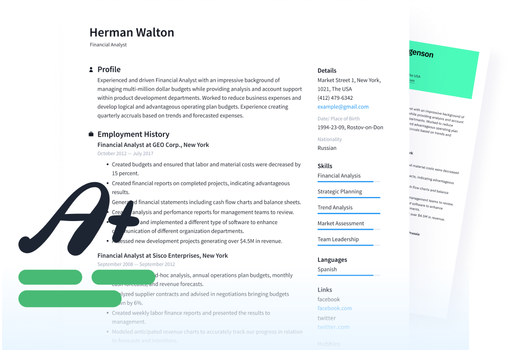
If you're using a black and white design, you can – for the most part – afford to add some colour into the mix, too. One way to do this is by using CV colours to accentuate specific parts of your document. For example, you might use these colours in your headers, section dividers, or as a sidebar. This approach means using tones sparingly rather than overtly.
Match the CV colours to your industry
When you're deciding which CV colours to use, it's smart to match them to the industry that you're in. For example, if you're in a traditional industry like law or teaching, you may want to go with a black and white design. If, on the other hand, you work in the creative field, you can use more flamboyant colours within your CV design.
Make sure your CV can be read
Using colour on a CV is no issue… unless it affects the document's legibility. Once you've applied your CV colours, always have someone (other than you!) review it to assess its overall readability. Remember, your top priority is ensuring that the hiring manager gets the information they need from your CV!
Use standard CV formatting practices
While you can use colour on your CV, it's always smart to follow standard formatting practices. Here are some of the tips that you should keep in mind at all times:
Use proper spacing between CV sections
Choose a CV font that suits the vibe of the document
Avoid adding pictures or graphics
Use a uniform design throughout your CV
Of course, there are exceptions to some of the above rules. Keep in mind that the aim of the game is to make your CV attractive while still being easy to read. When you're creating this document, always consider how it will look to a recruiter. A simple approach is often the best!
Make the right impression
Using colour to add some pizazz to your CV is okay as long as it presents you and your application in the best, professional light. Why not start by referring to the basic guidelines and colour meanings we've outlined in this guide, and refresh your document with the right CV colours today? After all, there's no better time than now to supercharge your job search!
Free Resume CV
Ensure your cv aligns with what employers are actually searching for.
Recommended reading:
See how your cv stacks up
Related Articles